Portfoliage
Check. One, two, three.
My cbox is filled with spam. I hate it.
Here we go again.
Did you see? I created a word. I am very proud of this word.
It is a composite.
port·fo·li·o [noun]As the title suggests, this post will be dedicated to the various design projects I have assembled since the year began. I don't think I've posted any other artwork this year, have I?
The materials collected in a portable case, especially when representative of a person's work: a photographer's portfolio; an artist's portfolio of drawings.
fo·li·age [noun]
Plant leaves, especially tree leaves, considered as a group.
Well, can't really remember but it doesn't matter anyway.
Exhibit A is my Psychology homework.
 I hope you're all taking notes.
On the actual presentations, Samaritanism and Conservation were two really, really easy chapters. A small part of me wishes I could have done one of the more challenging topics though - the physiological studies come to mind here - but on the whole I'm glad I got them over with early in the year.
 I did this piece with Guan Xiong back in February: one of his projects for the architecture foundation. I have to admit I envy him. He's getting graded for the very things I do for kicks. But I don't think I want to be an architect... Not until I've thought about it some more anyway.
 I did this piece with Guan Xiong back in February: one of his projects for the architecture foundation. I have to admit I envy him. He's getting graded for the very things I do for kicks. But I don't think I want to be an architect... Not until I've thought about it some more anyway.
So it's a sniper on a cloud with hands for feet, ripping a pair of wings off the back of an angel with towers as legs, aiming a rifle at a nun crying bloody tears into a rippling pool above a habit that's also a graveyard, a bridge sticking out of her head and a finger missing from her hands...
Obviously a war montage.
Did I? Yes.
But I just had to explain it to you.
Obviously a war montage.
The soldier represents, well, a soldier. He isn't a sinister character, just an ordinary man driven to atrocities by a higher authority.Did you find that a tad pretentious? Maybe.
The higher authority is represented by the fist in the clouds above the soldier - meaning not mere military might but also corporate greed - it is symbolic of the men in power, the real masterminds behind the war, and their motivations.
The latter can be seen clearly in the golden bridges arcing towards the fist: wealth, territory and ever self-perpetuating power.
The weeping nun represents peace under threat. The blood in her tears is the suffering of the millions the war has killed or displaced. The ripples symbolize the far-reaching effects of the war - no one anywhere is truly safe while it continues.
Her hands are raised in a pleading position, but even as she prays we see she has lost a finger in a most brutal fashion - another symbol of painful and crippling loss. The near-endless horizon of graves serves as a sombre reminder as to the heavy cost of armed conflict, a tale eternally retold in the pages of human history.
The severed bridge between her and the soldier is representative of the breakdown in communication that preceded the war. A figure dangles precariously off the edge of the bridge, the everyman caught in between opposing forces and imperiled as a result.
The bloody-winged angel represents the loss of freedom brought about by the war, and the death of dreams unfulfilled when the lives of the next generation are prematurely extinguished.
The city set against the blood red sky suggests that no matter how vast our metropolii (the dictionary gives "metropolises" but this feels right to me) and how tall our skyscrapers, a war is all it takes to turn our smug civilization on its head and bring the walls of false security crashing down around us.
And finally, the butterfly perched on the moon adds a theme of redemption to this otherwise grim portrayal - even in the darkest night, hope presents itself to those who look for it.
Did I? Yes.
But I just had to explain it to you.
 5W 2007 class page. This is how it would have looked - should have looked if they'd only printed them right. I swear putting this one together was the biggest pain - two pages just isn't enough, and the spread looks cluttered as a result.
 The original 5C 2007 class page. The one currently within the pages of the yearbook was edited for content after the school objected. Personally, I don't see anything wrong with Delicia being Delicia.
 Never used. After all the trouble me and Jason went through to come up with suitably irreverent latin for each of the monarchy, someone had to go and lose all the certificates on prom night.
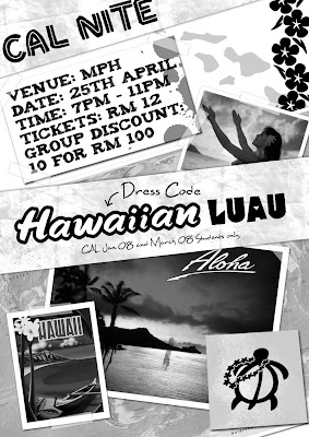
 The poster for the freshly-minted student council's April '08 CAL Nite.
 And the accompanying ticket. I like this one.
 Which was later shrunk to cut costs. Did I mention I somehow got a fifty dollar discount on printing? Some people refuse to believe I didn't pick up a couple of STDs in the process.
I'm not too happy with either design, by the way. I just don't like designing stuff for proms. It's so stiffy and formal and I can't bring myself to think out of the box.
Besides, once is enough.
Besides, once is enough.
 Controversy. This poster was never published because the office deemed it too provocative. I still think it's pretty cool though.


